Your Tech Story

User experience

Windows 11

Microsoft to Improve Default App Settings in Windows 11?

One of the lasting effects of the browser battles of the 1990s has been an excessive focus on how Microsoft manages default app settings in Windows 11, particularly browser settings.

Microsoft’s handling of app defaults in Windows 11 has frequently drawn criticism. In comparison to Windows 10, the latest operating system makes it harder for users to switch from Microsoft’s pre-installed apps to third-party ones.
Windows 11
Image Source: timesofindia.indiatimes.com

That could soon change, though, as Microsoft intends to make it simpler for users who want to alter the default Windows 11 apps.

Also Read: With GPT-4, are we one step closer to losing our jobs?

Microsoft announced the new feature for Windows 11 users in a blog post, stating that it is “reaffirming our long-standing approach to put people in control of their Windows PC experience.” This feature will allow users to quickly control changes to their app defaults.

Microsoft stated in a blog post,”We want to ensure that people are in control of what gets pinned to their Desktop, their Start menu and their Taskbar as well as to be able to control their default applications such as their default browser through consistent, clear and trustworthy Windows provided system dialogs and settings.”

The tech juggernaut was reacting to the cumbersome app-switching procedure. For instance, if a user wishes to switch from Edge to Chrome as the default browser, they must manually set Chrome as the default for each corresponding file and link type in addition to setting Chrome as the default browser overall.

Later OS updates made switching between browsers a little bit simpler, allowing you to select a default browser with just one button by going to that browser in the Default Apps section of the Settings app. However, compared to Windows 10, the option was still hidden, and it only worked for browsers, limiting image editors and other apps to use the more complicated one-file-type-at-a-time controls.

Microsoft will now give developers of apps “the ability to make their app the default or pin their app to the taskbar” through a “commonly supported way”. Additionally, it stated that its own apps would adhere to the same standard for defaults and pinning in order to prevent favoritism for the applications in its ecosystem.

Also Read: How to set up Discord on PS5 and PS4?

Developers will be given a new Settings deep link URI (Uniform Resource Identifier) so they can direct their customers to the proper default settings. Microsoft will launch an API for app pinning that will let external apps be instantly pinned as the taskbar’s main or secondary tiles. According to Microsoft, these new features will initially be available on the Windows Insider Channel over the following few months.

It is not necessary to use these new features, and app developers who are already handling things distinctly won’t need to alter their apps right away. However, the business claims that later this year, after application developers have had time to implement these new best practices, it will start taking more steps to prevent “unrequested modifications to a user’s choices.”

uber

Uber’s Redesigned App Puts The Focus On Personalization

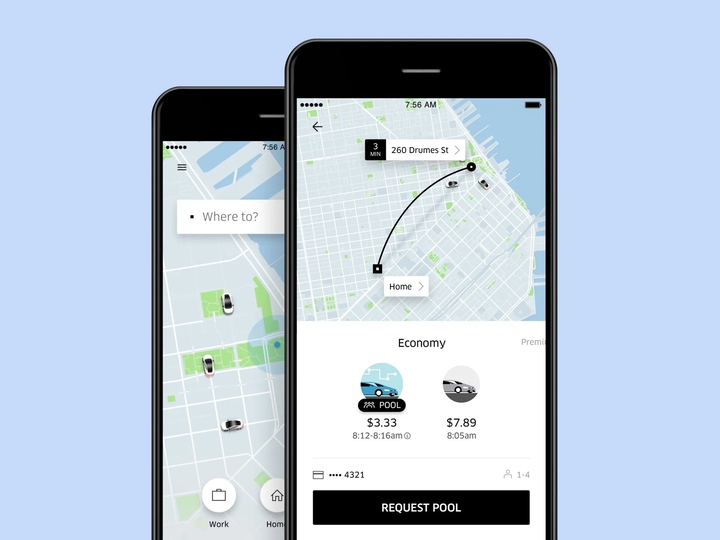
Uber has unveiled an upgraded version of its application that focuses on simplifying and customizing the user experience.
The updated app has a simpler home screen, which eliminates the resistance of a few additional clicks when making reservations for a ride or placing orders for delivery.

Uber
Image Source: wired.com

It also simplifies the way consumers can view saved venues, as well as some iPhone users can monitor the advancement of a trip on their lock screen.

Also Read: Google tests blocking news content for some Canadians

With the redesign, Uber wants to make the user experience so effortless and intuitive that more customers see Uber as the “one-stop shop for going anywhere and getting anything,” according to Jen You, head of product for rides at Uber.


“The redesigned Uber app has increased awareness and consideration to a wider array of products, which has driven growth to several lines of business,” You told TechCrunch. “This redesign leans into our platform strategy by expanding the breadth and relevance of products that Uber customers can engage with every time they open the app, especially Uber One members who use more of our products more often and will now have easier access to all the offerings in their city.”


Reference is taken from: https://techcrunch.com/2023/02/22/uber-redesigns-app-for-simpler-more-personalized-experience/
As per Uber, the update will be distributed to “tens of millions” of consumers in 1,200 cities worldwide on Wednesday. Customers must ensure that their devices and the Uber application have been upgraded to access the new app.


A simpler Home Screen
Several Users have had a glimpse of the updated home screen for several weeks now. The latest home screen incorporates carousels that prompt users with “More ways of using Uber,” “Ways to prepare with Uber,” or “Ways to save with Uber,” which would offer choices for facilities such as introducing a stop across a route, linking with public transportation, riding a Lime e-scooter, or selecting an even smoother riding experience.


At the screen bottom, the latest “Services” tab lists all of the trips and delivery resources obtainable in that city, such as e-scooters, supper choices, rental cars, delivering packages, and bus charter facilities. A new “Activity” button at the bottom of the screen lets customers keep a record of past and forthcoming trips and Eats bookings.


Getting to know you better
“Saved Places” will show up as a recommendation of locations and travel types predicated on a user’s preferences, previous trips, and also most probable locations whenever a user presses “Where to?” on the latest app. The app will keep gathering information about the user to provide more personalized suggestions in the future.

Also Read: Amazon Web Services pairs with Hugging Face to target AI developers


Updates to live tracking
iPhone owners running iOS 16 or subsequent can monitor their trips without manually opening the Uber app by using a “dynamic island,” which is essentially a little sphere that shows content that’s operating in the background. Users now receive alerts on their lock screen whenever a driver seems to be on their way or near to pick-up.

The dynamic island would then consistently show information such as automobile details which includes the driver’s photo, license plate, model of vehicle, and image of the vehicle as well as the most recent ETA and ride status.